Spotify stays ahead of the curve almost solely off on its ability to curate music and help you discover new tracks to love. With all the same music being offered on all the same streaming services, music lovers continue to return to the platform because it’s the best in the game at discovering fresh new music, and there’s no better feeling for a music fan than that!
A massive aspect of Spotify’s success on this front comes from its user-generated playlists. Spotify knows this and does everything it can to arm its users with all the necessary tools to create professional-looking playlists. Fans use playlists to curate selections of their favorite releases; artists use playlists to help build their brand and sonic identity; labels use playlists to give their brand a foothold on a platform that prioritizes the exposure of artists over labels, and so much more. Having an awesome playlist can make or break your industry career and open up many doors for you, whatever your endeavors on the platform may be.
But without great curb appeal, which is to say an excellent playlist cover, nobody is likely to give your well-crafted playlist that you spend hours expertly curating a shot!
So let’s break down each process step and provide high-level insights into making the most of the small-and-simple image that ultimately defines your playlist.
This article is a follow-up post to our Complete Guide To Creating Custom Artwork For Your Spotify Playlist. Where that article talks about the basics; this one dives into more high-level insights into maximizing the effectiveness of the excellent playlist cover.
Looking For The Best Handmade Playlists In 2023? Look For Further
How Do You Make A Cool Playlist Cover?
Let’s dive into everything you need to know about making an incredible Spotify Playlist Cover Art. Some of these steps might seem easy, but they are all essential. For the apparent steps, we’ve gone the extra mile to provide higher-level design insights that can help elevate your Spotify Playlist Cover Art and help you make it professional AF.
Where To Start
The first thing you’ll need to do is to find an app or service that will let you edit images. This platform by no means needs to be as powerful as industry-standard programs like Photoshop. Here is a short list of some of the more popular web-based photo editing apps that will get the job done for you!
- Canva
- Pros: Besides photo editing, Canva offers a variety of design features, including templates for creating social media posts, posters, and other graphics, and has a large selection of fonts, icons, and stock images available for use. User-friendly interface. Available for free, with the option to upgrade to a paid version for additional features.
- Cons: Some users may find the selection of editing tools to be limited compared to other photo editors.
- Pixlr Editor
- Pros: It has a large selection of editing tools, including layers, filters, and advanced features like clone stamp and dodge/burn. Allows for saving in multiple formats, including PSD, PNG, and JPEG. Available for free, and no account is necessary.
- Cons: The interface can be overwhelming for new users. Some features are only available with the paid version.
- Fotor
- Pros: Offers a range of features for editing photos, including basic edits, filters, and frames. It has a user-friendly interface and offers various templates for creating collages and social media graphics. Available for free, with the option to upgrade to a paid version for additional features.
- Cons: The free version of Fotor is ad-supported, which can be distracting. Some users have reported that the app can be slow to load.
- PicMonkey
- Pros: Offers a variety of editing tools, including basic edits, filters, and overlays. It also has various design features, including templates and graphics for social media and other projects. User-friendly interface. Available for free, with the option to upgrade to a paid version for additional features.
- Cons: Some users have reported that the app can be slow to load. The free version is ad-supported.
- BeFunky
- Pros: Offers a variety of editing tools, including basic edits, filters, and graphics. Has a user-friendly interface and offers various templates for creating collages and social media graphics. Available for free, with the option to upgrade to a paid version for additional features.
- Cons: Some users may find the selection of editing tools to be limited compared to other photo editors. The free version is ad-supported.
We use Canva for all of our photo editing and content creation, and I know many other creators and writers do the same! So that’s an easy one for us to recommend, but we encourage you to try out a couple of different ones to find which ones work best for you – as they all have the unique things they do best.
What Size Should Playlist Cover Art Be For Spotify?
Your Spotify Playlist Cover Art design that you start to create in your photo-editing app must be square. And while they don’t have a maximum image size that you can use, they do have a 4MB limit on the file size you can upload.
The minimum size of the image is 300×300 pixels, but we encourage you to make a larger image and then reduce the file size using an app like ImageOptim to make larger-sized images use less file space.
This will ensure that you get high-quality, large-scale images to use as your Spotify Playlist Cover Art that looks high-res regardless of how the image scales to guarantee it still looks clear even when viewed on high-resolu
Choosing The Right Title

Choosing the right title goes hand in hand with selecting the Vibe you want this playlist to have. If you’re looking to store a collection of your favorite tracks for personal listening later, that’s one thing. But if you want to grow this playlist and use it as a tool, it’s important to be laser-focused on what you’re trying to accomplish with this playlist.
We will focus on two types of independent playlists: Vibe Playlists and Branded Playlists. The former of these two playlists is designed to curate a selection of music that matches the Vibe of a specific time or setting. The latter is used to help build a brand of something (i.e.; a record label makes a playlist of its entire discography). For this article, we will focus on the Vibe playlists for creating our Spotify Playlist Cover Art.
So with that in mind, what type of Vibe do you want to curate? The playlist’s title should match the Vibe, and it will likely be what your potential followers and fans are searching for when they’re looking for music to match that Vibe. Here are some examples.
- Melodic Deep House: This is a playlist curated by UOAK that features melody-driven dance music.
- Oriental Deep House 2023: The title of this playlist says it all, and you don’t even need to open up the playlist to know that it’s packed full of amazing groovy, ethnic deep house tracks released in 2023.
- Old School Hip Hop: A collection of amazing old-school hip-hop tunes for any retro enthusiast of the genre. If that’s the Vibe you’re looking for, this playlist makes itself VERY easy to find.
- Feeling Euphoric Then Depressed [Emotional Electronic Music]: This does a great job at a fancy title that is followed up by a more direct and descriptive label in brackets so that we know exactly what we are getting into while also being goaded to click and check it out.
If you ever need inspiration on coming up with a decent title that matches the vibe you’re after, look no further than Spotify itself. They have many algorithmic playlists that are a great source of inspiration, including Backyard BBQ, Cocktail Lounge, and others.
Be short, direct, punchy, and engaging. It’ll likely be evident if you need to think more about the title, and your fans will dig it less. Try to anticipate how people would be searching for your playlist. Organic Search is about user experience and how your fans use the platform. Cater to what they’re looking for; you’ll already be off to a better start than most.
If you want to build a branded playlist, here are some examples of DJs and labels who are doing it right and using all of Spotify’s tools to their fullest potential.
- Yotto’s Fresh Favorites & IDs: Yotto uses his playlist to curate a list of all the released music he’s been playing in his late sets. This is a great way to help fans connect the dots between his live shows and the music that he releases. It’s a simple form of storytelling that offers value.
- Welcome Home Radio: David Hohme’s weekly radio show, Welcome Hohme Radio, recently moved to have the tracklisting of all the released music he plays mirrored on this Spotify playlist. Fans curious about the music they hear in his radio shows can instantly find them here!
- Monstercat Silk | New Releases: This melodic house label uses a playlist to keep track of its complete discography. Spotify’s platform prioritizes exposing artists and producers to new audiences, and the label’s releasing the music is often left in the fine print at the bottom of the release. But having playlists can help give labels and brands a foothold here and make their name more known and accessible.
Choosing The Right Image
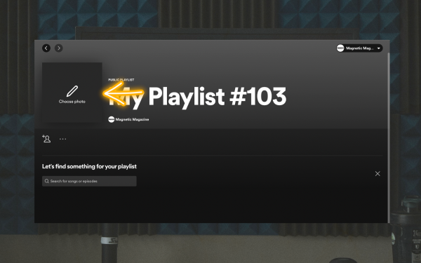
Once you’ve established the title you want for your playlist, it’s time to start creating the Spotify Playlist Cover Art Itself. We only had a starting point with the title, but now that we have a title, we can begin crafting the vibe of the Spotify Playlist Cover Art.
The most crucial step here is finding an image you can legally use. Below are a list of some of the most popular free-to-use image repositories online that should provide the answers you’re looking for.
- Unsplash
- Pros: Offers a large selection of high-quality images from a wide range of photographers. It has a user-friendly interface and allows for easy searching and filtering. All photos are licensed under the Creative Commons Zero (CC0) license, meaning they can be used for any purpose without attribution.
- Cons: As with any stock photo site, some images may be overused or less unique.
- Pexels
- Pros: Offers a large selection of high-quality images and videos. Has a user-friendly interface and allows for easy searching and filtering. All photos are licensed under the Creative Commons Zero (CC0) license, meaning they can be used for any purpose without attribution.
- Cons: Some images may be overused or less unique.
- Pixabay
- Pros: Offers a large selection of high-quality images, videos, and illustrations. It has a user-friendly interface and allows for easy searching and filtering. All photos are licensed under the Creative Commons Zero (CC0) license, meaning they can be used for any purpose without attribution.
- Cons: As with any stock photo site, some images may be overused or less unique.
- Gratisography
- Pros: Offers a selection of unique and quirky ideas that may be less commonly found on other stock photo sites. All photos are taken by photographer Ryan McGuire and are licensed under the Creative Commons Zero (CC0) license, meaning they can be used for any purpose without attribution.
- Cons: The selection of images is more limited compared to other stock photo sites.
- Burst by Shopify
- Pros: Offers a large selection of high-quality images, as well as some videos. Has a user-friendly interface and allows for easy searching and filtering. All photos are licensed under the Creative Commons Zero (CC0) license, meaning they can be used for any purpose without attribution.
- Cons: The selection of images may be more limited compared to other stock photo sites.
Choosing The Right Text
Fonts can have a significant impact on how we perceive and process information. In general, people tend to associate different fonts with different emotions, ideas, and values.
For example, serif fonts like Times New Roman or Garamond are often associated with tradition, while sans-serif fonts like Helvetica or Arial are associated with modernity and simplicity. Additionally, a font’s spacing, size, and style can influence how easy or difficult it is to read and understand information. Studies have found that fonts that are easy to read and understand can lead to better comprehension and recall of information. In contrast, fonts that are more difficult to read can lead to confusion and lower levels of awareness.
When creating cover art for Spotify playlists, choosing the right font can be crucial to the design’s success. The font you choose can convey the mood and genre of the playlist and help capture the attention of potential listeners. For example, if you’re creating a playlist of calming instrumental music, a font with a flowing, handwritten style might help convey a sense of relaxation and serenity.
Scroll through these few examples and think about the impression each of the different fonts gives you and what it makes you think about the playlist it’s attached to.


On the other hand, if you’re creating a playlist of upbeat pop songs, a bold, sans-serif font might help convey a sense of energy and excitement.
Additionally, the right font can also help make your playlist stand out in a crowded field of other playlists. By choosing a font that is visually striking and easy to read, you can increase the chances that someone will be drawn to your playlist and give it a listen.
How To Upload Your Spotify Playlist Cover Art
Uploading your Spotify playlist artwork is a simple task in the overall process. To get started, go to your playlist on Spotify and hover your mouse over the current artwork at the top. You’ll see a prompt to change the artwork.
Click on this button, and select the file you want to use from your computer or hard drive. Uploading your chosen artwork is a straightforward process similar to uploading on most other websites and apps.
It’s that simple! Oh, wait…
Amateur vs. Pro-Looking Spotify Playlist Cover Art
If it were that simple, wouldn’t everyone crushing it in the Spotify playlist game? Well, there are hundreds of things that separate the professional playlist curated from the amateur ones. So let’s dive into some of the biggest differences between the cool Spotify cover art that the pros use and the not-so-cool Spotify cover art that amateurs use.
Colors Are Important
Colors significantly impact how we perceive and react to visual stimuli. Different colors are often associated with other emotions and can evoke specific psychological responses. For example, warm colors like red and orange are often associated with energy, excitement, and passion, while cool colors like blue and green are associated with calmness and relaxation. Additionally, the brightness and saturation of a color can also influence how it is perceived. Bright and saturated colors are more attention-grabbing, while muted or desaturated colors can have a more calming effect.
When creating cover art for a Spotify playlist, the right color palette can make all the difference. The colors you choose can help convey the mood and genre of the playlist and attract potential listeners. For example, a playlist of peaceful, acoustic songs might benefit from a muted color palette that conveys a sense of calmness and serenity. On the other hand, a playlist of upbeat dance music might benefit from a more vibrant and energetic color palette. Also, choosing colors that complement each other can help create a cohesive and visually appealing design. By thoughtfully selecting a color palette that accurately represents the playlist’s mood and genre, you can increase the chances that someone will be interested in giving your playlist a listen.
If you’re struggling with a solid color pattern to start your playlist, try checking out Coolers.com, which can instantly generate color palettes that “work” together to achieve all the abovementioned goals.
Make It Pop!
Contrasting colors can have a powerful effect on how we perceive visual information. When colors with opposite hues are placed together, they create a high level of contrast that draws the eye and creates visual interest. This contrast can make some aspects of a design pop, develop a sense of depth and dimensionality, and make the overall design more dynamic and visually appealing. Additionally, contrasting colors can help with visual clarity and legibility, making it easier for viewers to read text or discern essential details.
To create a cool Spotify playlist cover art using contrasting colors, start by considering the mood and genre of the playlist. For example, you might use a bright, contrasting color for the text to make it stand out against a more muted or desaturated background.
Or you could use contrasting colors to highlight certain design elements, like the title of the playlist or a particular image. Be careful to do just what is necessary; too many contrasting colors can create visual chaos and make the design look cluttered or confusing. Using contrasting colors thoughtfully, you can create a relaxed and attention-grabbing Spotify playlist cover art that accurately represents the playlist and appeals to potential listeners.
Don’t Go Overboard
Minimalism is key here, and going overboard will be more offputting than the subconscious of your listeners even realizes. You need to add a few small effects, filters, or touch-ups to your cool spotify playlist art. Remember, the entire point is to draw attention to the playlist’s title, and the rest should just be a temporary visual connection between the title, artwork, and music included.
Here are a couple of fast and easy rules of thumb that changed my perspective on minimalism in all of my designs:
- Keep it simple: The essence of minimalism is to create a clean and uncluttered design. To achieve this, focus on using only the essential elements and removing any unnecessary or distracting details.
- Use negative space: Negative space, or the space between elements, can be a powerful tool in minimalistic design. By strategically using negative space, you can create a sense of balance, emphasize certain elements, and create a more dynamic composition.
- Stick to a limited color palette: A limited color palette can help maintain the simplicity of a design. Consider using one or two dominant colors with a few complementary colors to add interest and variety.
- Be consistent: Consistency is key in minimalistic design. Use compatible fonts, spacing, and layout throughout the design to create a cohesive and harmonious look.
- Prioritize readability: Minimalism doesn’t mean sacrificing readability. Make sure your design is easy to read by using legible fonts, appropriate font sizes, and good contrast between text and background.
- Create hierarchy: Even in a minimalist design, it’s essential to create a hierarchy of elements to guide the viewer’s eye and convey the intended message. Consider using size, color, and placement to create a clear hierarchy of information.
It’s Not Just About The Artwork…
Writing a phenomenal description for your Spotify playlist is crucial in helping it get discovered by listeners. A great description will inform potential listeners about the content of the playlist and entice them to hit the play button. To start, consider the tone and mood of the playlist, and use language that reflects this. For example, if the playlist is for relaxing, use descriptive words that convey a sense of calm and tranquility. It’s also essential to make the description concise and to the point, so potential listeners can quickly grasp the main idea of the playlist. Be sure to include information about the type of music, artists, and genres included, as well as any other unique features or themes that make the playlist special.
Another pro tip is to use keywords relevant to the playlist’s content. This will help your playlist appear in search results when people are looking for specific types of music. Include relevant genres, moods, themes, and keywords in your description. You can also include hashtags in your description to increase visibility and make it easier for people to find your playlist. Additionally, it’s a good idea to update the description periodically to keep it fresh and relevant. This can help attract new listeners and keep current followers engaged.
In summary, writing a phenomenal description for your Spotify playlist involves:
- Using descriptive language that reflects the mood and tone of the playlist.
- Being concise and to the point, including information about the type of music and any unique features or themes.
- Using relevant keywords and hashtags to increase visibility.
By following these pro tips, you can increase the discoverability of your playlist and attract more listeners.
It’s About The Music Too!

And while having an excellent Spotify cover art piece can certainly attract exponentially more potential fans and listeners, if the music could be better and also be updated frequently and consistently, then people will assume it’s only worthy of being a ghost town playlist.
And while keeping up with curating a fantastic playlist and finding incredible music to stock it with might seem like a full-time job, Spotify has many tools that can help you discover fantastic music fast. And while all these tools go beyond the scope of this article, a good starting point would be to check out how entire guide on how the Spotify Enhance Button works. That alone should save you hours and help you easily update and maintain top-level playlists.
Final Thoughts
In conclusion, creating a great playlist cover on Spotify can be the key to getting your playlist noticed, and the tips and examples in this article can help take your cover art to the next level. From the use of typography and color palettes to the importance of image selection and contrast, the insights shared in this article provide a blueprint for creating professional-looking and eye-catching playlist covers.
By following these high-level tips and applying them to your cover art, you can increase the chances of your playlist being discovered and enjoyed by a wider audience. Whether you’re a musician, curator, or music lover, this article’s tips and case studies can help you create a playlist cover that stands out on Spotify.
Will Vance is a professional music producer who has been involved in the industry for the better part of a decade and has been the managing editor at Magnetic Magazine since mid-2022. In that time period, he has published thousands of articles on music production, industry think pieces and educational articles about the music industry. Over the last decade as a professional music producer, Will Vance has also ran multiple successful and highly respected record labels in the industry, including Where The Heart Is Records as well as having launched a new label with a focus on community through Magnetic Magazine. When not running these labels or producing his own music, Vance is likely writing for other top industry sites like Waves or the Hyperbits Masterclass or working on his upcoming book on mindfulness in music production. On the rare chance he's not thinking about music production, he's probably running a game of Dungeons and Dragons with his friends which he has been the dungeon master for for many years.